Why Include Maps, Charts, and Graphs?

Maps, charts, graphs, diagrams, and similar technical art enhance the content by:

• Presenting content in a visual way—“A picture is worth a thousand words”

Detail from water resources infographic

• Presenting data visually so that trends are visible at a glance

Bar Graph for Criminology textbook. © McGraw-Hill.

• Providing spatial context (e.g., where a battle was fought relative to population centers; distribution of rainfall, species, or manmade features)

• Providing visual interest to a page, or reinforcing the overall design of the publication


Map Design Post #1

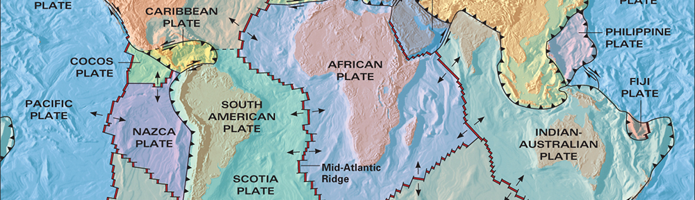
Many of these map design tutorials date from several years ago, but the lessons are still relevant. I’m starting with some examples of maps in publications that you could get at the bookstore or library. The maps don’t need to be complex.

Simple maps, with a few key design elements, can enhance and support the overall design theme or content of a publication or presentation.

I’ll be adding information periodically, so please check back every week or two.

Here are some examples from published books you may have seen on the bookstore shelves (good reads, too, by the way.)


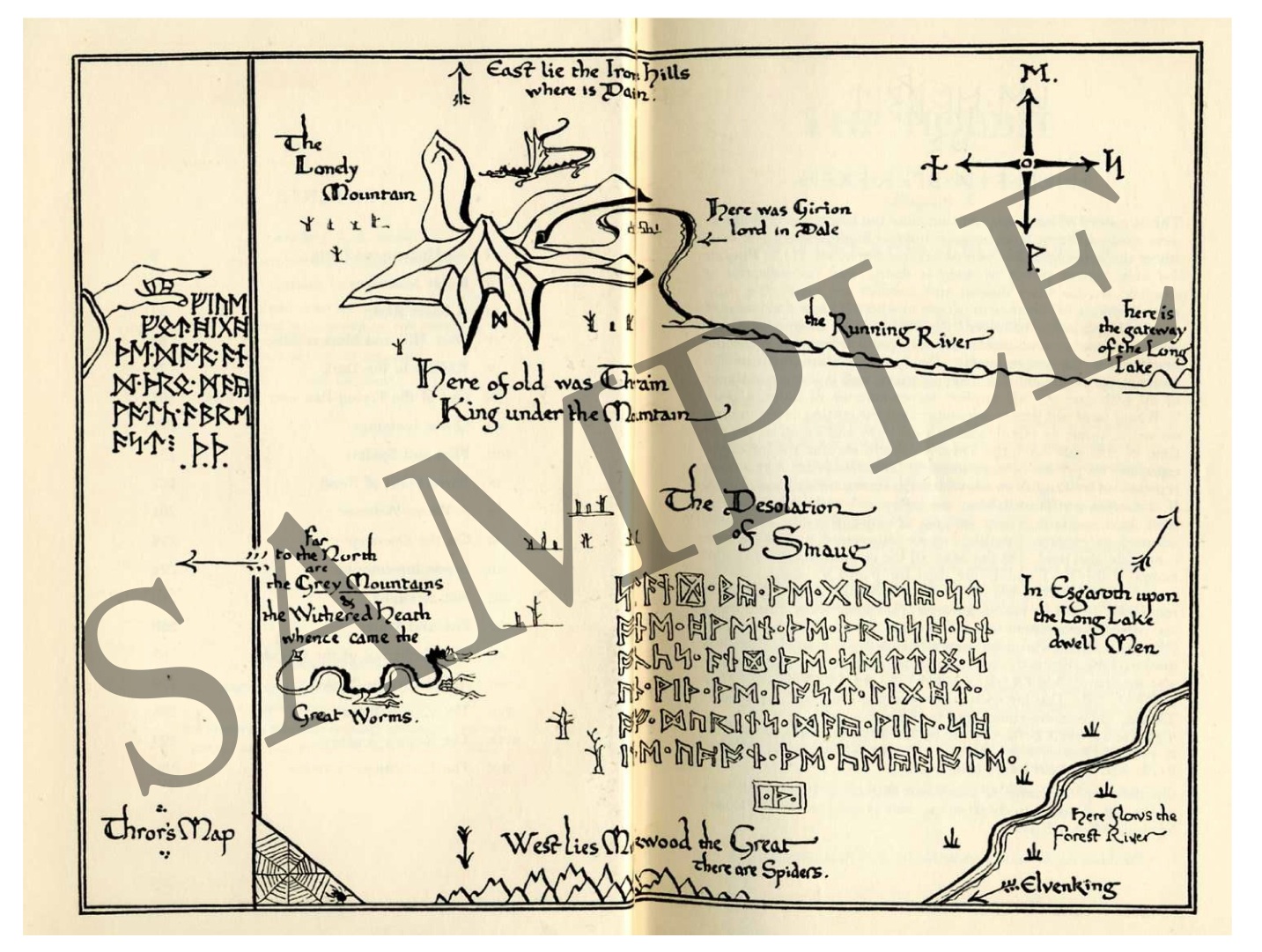
Frontmatter map from The Hobbit by J.R.R. Tolkein © 1966, Houghton Mifflin Company.

The map, like other illustrations in the book, was drawn by the author and incorporates runes of the author’s creation and his characteristic line quality and calligraphy. Elements of the map underscore the ancient and epic content of the book.

For more info about this book, please visit Houghton Mifflin’s web page:

http://www.houghtonmifflinbooks.com/features/lordoftheringstrilogy/

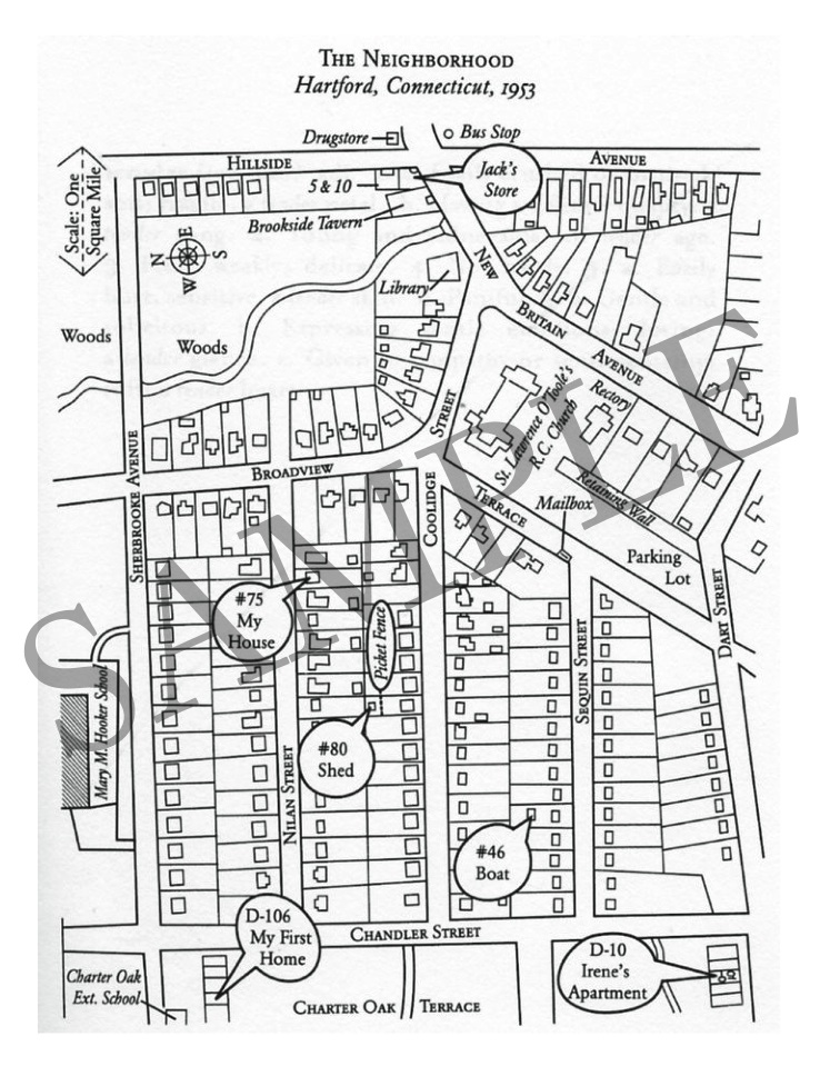
This simple map illustrates the layout of neighborhood where a crime occurred. Having the map to refer to helps readers visualize and understand convoluted details as the author recounts her own experiences and the criminal investigation of the event.

The book here is Girls of Tender Age by Mary-Anne Tirone Smith © 2005, The Free Press. More info (and how to purchase on Amazon–it’s a great book!) at this link:

http://www.amazon.com/Girls-Tender-Mary-Ann-Tirone-Smith/dp/0743279786

A little company history

My original Parrot Graphics logo

For years I worked under the name Parrot Graphics. I started my company in the 1980s when a cheeky computer company took the name Apple. I figured I could use a whimsical name, too.

I built that business with literal cold calls…you know, picking up the phone (the kind attached to the wall with a cord) and asking to be connected to the production and design manager at publisher X. I’d give a quick elevator pitch (“I’m a cartographer who’s worked for the Minnesota Geological Survey and National Geographic”) and then ask if they’d like me to send a printed sample sheet. I’d put it in the mail and follow up a week or two later with another phone call. My portfolio wasn’t huge but the work was good. Textbook publishers were my best customers.

Eventually I landed big clients like Houghton Mifflin in Boston and McGraw-Hill in New York and San Francisco, but also midsize and small publishers throughout the country. Business hummed along until the late 1990s-early 2000s, when a wave of mergers consolidated my once-diverse stable of 40 or 50 clients into three or four behemoths who eliminated production stateside in favor of outsourcing to India.

The name Parrot Graphics hasn’t been great for Google searches; people think I make pictures of birds. It’s time for a reboot. I rebranded as 45th Parallel Maps and Infographics a few years ago—the name is a  geographic reference to the latitude where I live—but it’s a little clunky and hasn’t really taken off. For now I’m just using my name, Patti Isaacs, and the taglines “Art from data” and “I make GIS beautiful” which pretty well sum up my talents.

As Parrot Graphics, I maintained a blog full of map design ideas, and in the coming weeks I’ll be posting much of that content here.

Airplane View: Love letter to life around the 45th parallel

I contend that when it comes to map reading and navigating, there are two types of people: “tube” people and “airplane” people. Tube people navigate by the landmarks they see as they drive along, turning left or right as directed. I think that because GPS navigation systems present only a narrow slice of a route, they promote the tube view. On the other hand, airplane people see a place as if they were flying above it, and often prefer to navigate using cardinal directions, north, south, east, and west. When you look at a map of an area, whether in print or online, you see where one feature is in relation to others in the region: the airplane view.

Because I love maps, I also love air photos, satellite images, and drone videos. This drone video by Twin Cities videographer Tyler Mason looks at life around the 45th parallel from the air. It shows why I love living here. And it’s presented by Bring Me the News, a journalist-run website featuring all that is interesting, timely, and important to know about Minnesota.


Upcoming event: New York reading of Looking for Old Xi’an

Upcoming event: November 16, 2018, 6 pm, at Manhattan Chinatown’s Aeon Bookstore 151 East Broadway, NY, NY 10002.

https://www.facebook.com/events/769561453403753/

I’ll be reading my piece, “Looking for Old Xi’an” from the Shanghai Literary Review’s anthology, Concrete.

Xianning Lu east of Xi’an Jiaotong University Campus, 1981

Xianning Lu from a similar vantage point, 2005 (taken from the safety of a pedestrian bridge.)

PowerPoints

In the last couple of years I’ve been asked to create content for PowerPoint presentations as ancillaries to textbooks for Pharmacy Techs. For this project I gleaned primary points from the text and presented those as bullet points with supporting graphics, also derived from the textbook. In addition, I created chapter summaries and interactive quizzes unique to the PowerPoint deck.

Screen Shot 2017-09-14 at 7.59.37 PM

Screen Shot 2017-09-14 at 8.00.49 PM

Screen Shot 2017-09-14 at 8.13.16 PM


Pen and Ink Throwback

When a client recently asked about someone to do some botanical illustrations, it occurred to me that I used to do all kinds of pen and ink illustrations. In fact, the parrot here was part of my first company logo. If you want a warm, retro look, consider this treatment. Here are some plants, a couple of birds, and a map.

Pen and Ink puffin illustration

Pen and Ink puffin illustration

Pen and ink cross section of prairie plants

Pen and ink cross section of prairie plants

Pen and Ink map of French Indochina

Pen and Ink map of French Indochina

Pen and ink parrot

Pen and ink parrot

Pen and Ink flower illustrations

Pen and Ink flower illustrations

How a cartographer changed our understanding of geology

Image credit:  WORLD OCEAN FLOOR PANORAMA, BRUCE C. HEEZEN AND MARIE THARP, 1977. COPYRIGHT BY MARIE THARP 1977/2003. REPRODUCED BY PERMISSION OF MARIE THARP MAPS, LLC 8 EDWARD STREET, SPARKILL, NEW YORK 10976

Image credit:
WORLD OCEAN FLOOR PANORAMA, BRUCE C. HEEZEN AND MARIE THARP, 1977. COPYRIGHT BY MARIE THARP 1977/2003. REPRODUCED BY PERMISSION OF MARIE THARP MAPS, LLC 8 EDWARD STREET, SPARKILL, NEW YORK 10976

Marie Tharp and her ocean floor maps were an important part of my budding interest in maps and cartography. This article underscores the power of images to educate, which is why I got into this field.

http://mentalfloss.com/article/60481/how-one-womans-discovery-shook-foundations-geology

North Shore Book to be published in 2015

Map of northeastern Minnesota incorporating GIS relief and vegetation information

Map of northeastern Minnesota incorporating GIS relief and vegetation information. © University of Minnesota Press.

I’ve created maps and graphs for a lengthy and lavishly illustrated book about the North Shore of Lake Superior to be published by the University of Minnesota Press in 2015.

The most complex of these maps, depicting vegetation of northeastern Minnesota appears above. Michael Schmeling of Aridocean.com created the relief base and registered raw vegetation from GIS data to it before I restyled the piece to coordinate with the overall book design.

Vegetation information was originally to appear as part of the section opener maps but these became so complex that the beauty and spatial distribution of the vegetation was lost. We decided to make this a stand-alone graphic.

Those familiar with the geography of northeastern Minnesota can clearly see where hardwoods crown the bedrock ridge running along the lake (the fiery maple-red color was an intentional choice), the turquoise line representing white and red pine along the Iron Range north of Virginia, and the flat boggy area drained by the St. Louis River between Hibbing and Cloquet, represented here by purple and yellow tints.

I also managed the talent of natural history artist Vera Ming Wong, whose watercolors—both accurate and beautiful—will appear in the book.

Here’s a link to the Press’s website.

http://www.upress.umn.edu/book-division/books/north-shore

Informational Healthcare Booklets

Cover for informational booklet about XXY genetic condition

Cover for informational booklet about XXY genetic condition

Cover for informational booklet about Trisomy X

Cover for informational booklet about Trisomy X

Cover for informational booklet about genetic condition XXY, or Klinefelter syndrome

Cover for informational booklet about genetic condition XXY, or Klinefelter syndrome

Interior of XYY booklet with cartoon illustration by Harry Briggs

Interior of XYY booklet with cartoon illustration by Harry Briggs

Interior of XXY booklet with cartoon illustration by Harry Briggs

Interior of XXY booklet with cartoon illustration by Harry Briggs

Interior of XYY booklet with cartoon illustration by Harry Briggs

Interior of XYY booklet with cartoon illustration by Harry Briggs

I edited, designed, and produced a series of three educational booklets for patients with the genetic conditions Trisomy X, XXY, and XYY (Klinefelter syndrome) for the nonprofit organization AXYS. The booklets are distributed free of charge to young people with these conditions, and as such they needed to be accessible and appealing. Cartoon illustrations by Harry Briggs http://www.hairballdesign.com/ are fun and casual without being trite or “too cute.”

The booklets were designed to coordinate with the organization’s recently updated website, http://www.genetic.org/