Many of these map design tutorials date from several years ago, but the lessons are still relevant. I’m starting with some examples of maps in publications that you could get at the bookstore or library. The maps don’t need to be complex.
Simple maps, with a few key design elements, can enhance and support the overall design theme or content of a publication or presentation.
I’ll be adding information periodically, so please check back every week or two.
Here are some examples from published books you may have seen on the bookstore shelves (good reads, too, by the way.)

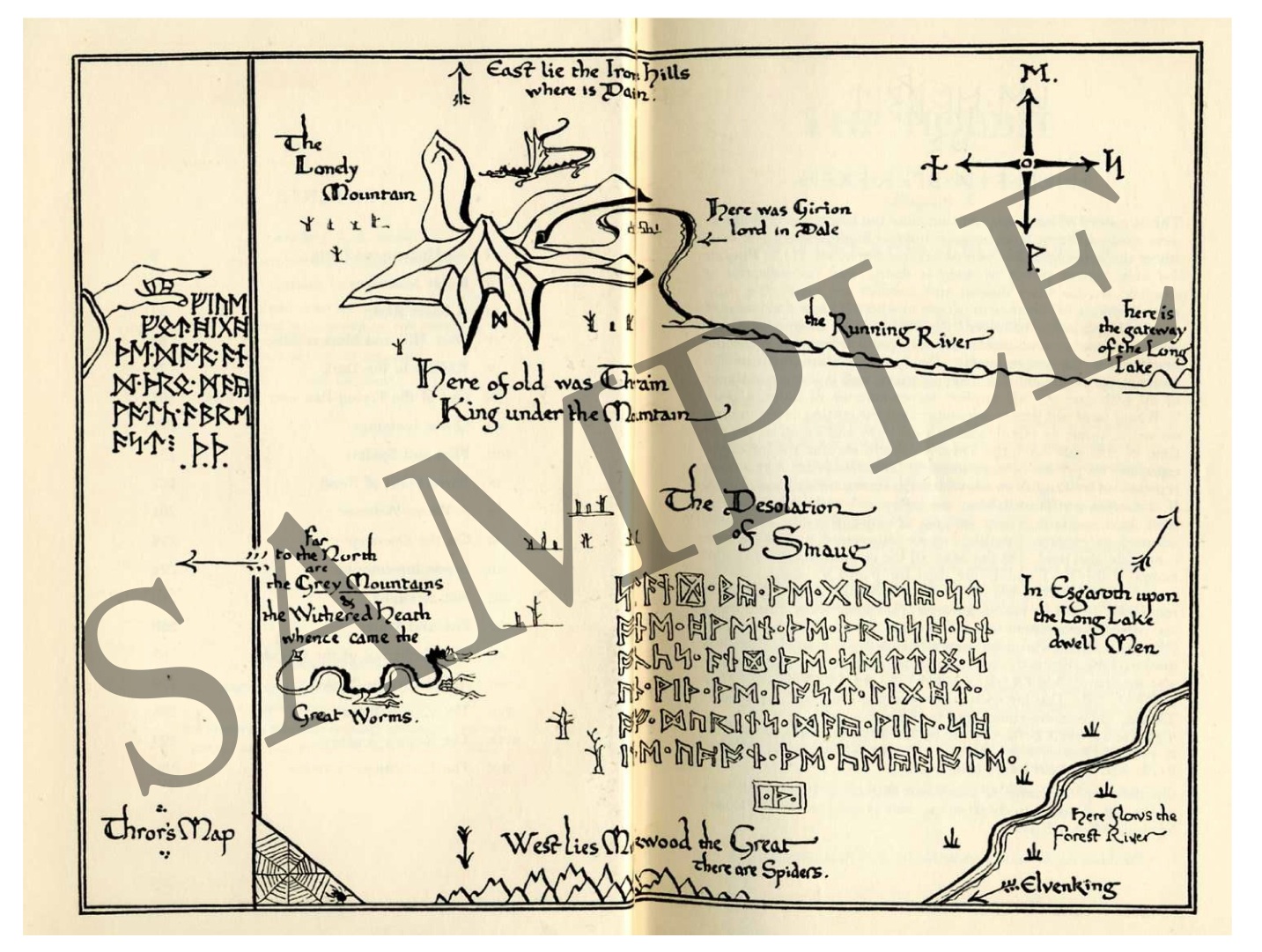
Frontmatter map from The Hobbit by J.R.R. Tolkein © 1966, Houghton Mifflin Company.
The map, like other illustrations in the book, was drawn by the author and incorporates runes of the author’s creation and his characteristic line quality and calligraphy. Elements of the map underscore the ancient and epic content of the book.
For more info about this book, please visit Houghton Mifflin’s web page:
http://www.houghtonmifflinbooks.com/features/lordoftheringstrilogy/

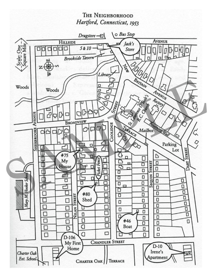
This simple map illustrates the layout of neighborhood where a crime occurred. Having the map to refer to helps readers visualize and understand convoluted details as the author recounts her own experiences and the criminal investigation of the event.
The book here is Girls of Tender Age by Mary-Anne Tirone Smith © 2005, The Free Press. More info (and how to purchase on Amazon–it’s a great book!) at this link:
http://www.amazon.com/Girls-Tender-Mary-Ann-Tirone-Smith/dp/0743279786
