Maps, charts, graphs, diagrams, and similar technical art enhance the content by:
• Presenting content in a visual way—“A picture is worth a thousand words”

Detail from water resources infographic
• Presenting data visually so that trends are visible at a glance
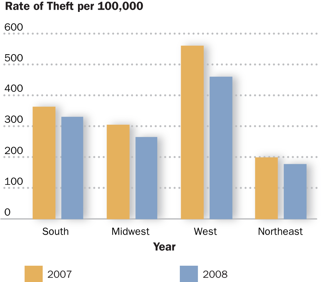
Bar Graph for Criminology textbook. © McGraw-Hill.
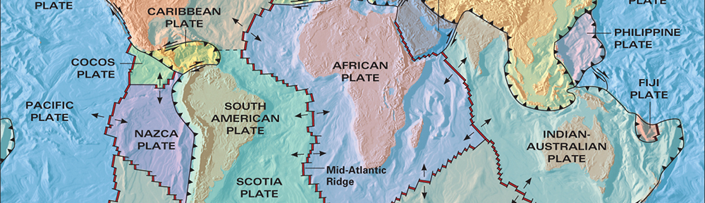
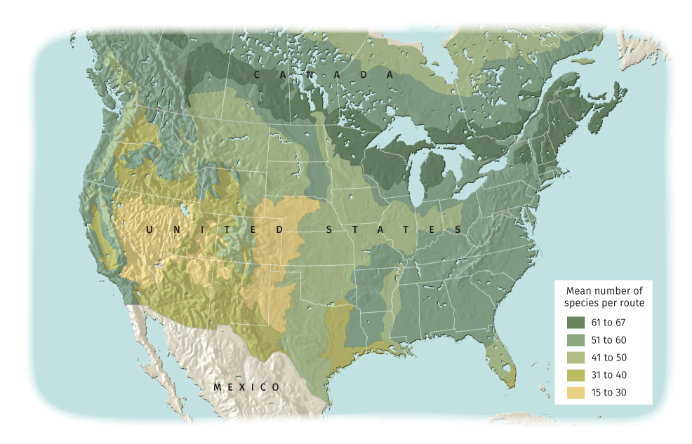
• Providing spatial context (e.g., where a battle was fought relative to population centers; distribution of rainfall, species, or manmade features)
• Providing visual interest to a page, or reinforcing the overall design of the publication
